
Systems design at scale
I worked on defining grid structures and early variable use at Xbox which turned into a multi-year infrastructure project that has changed how Xbox designs at scale across mobile, handheld, desktop, web, TV.
Role
Product designer
Worked across
- Design tokens & foundations
- Component libraries & patterns
- Documentation & adoption
- Cross-surface consistency
Partnered closely with
- Product designers
- Client engineering
- Accessibility
Problem & opportunity
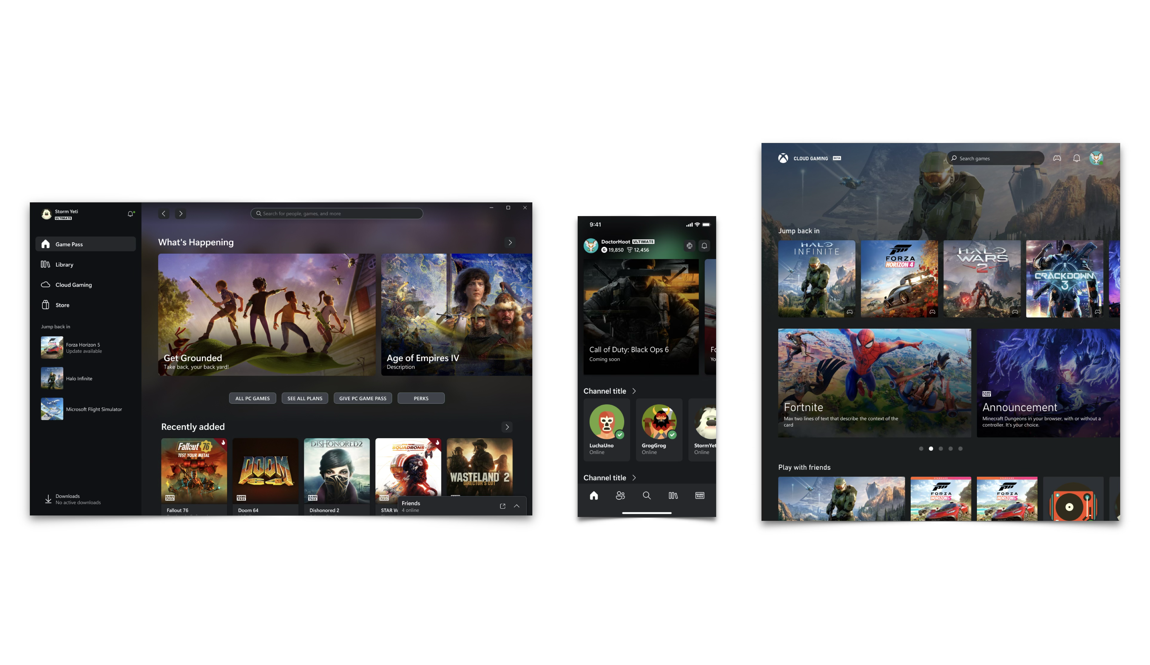
As Xbox experiences multiplied across web, console companion apps, and smart TV, we had multiple libraries and tech stacks, inconsistent delivery, and players moving towards multi-endpoint play. If we could standardize how we built across Xbox, we would save a ton of time, and deliver more consistent experiences more often.
Vision
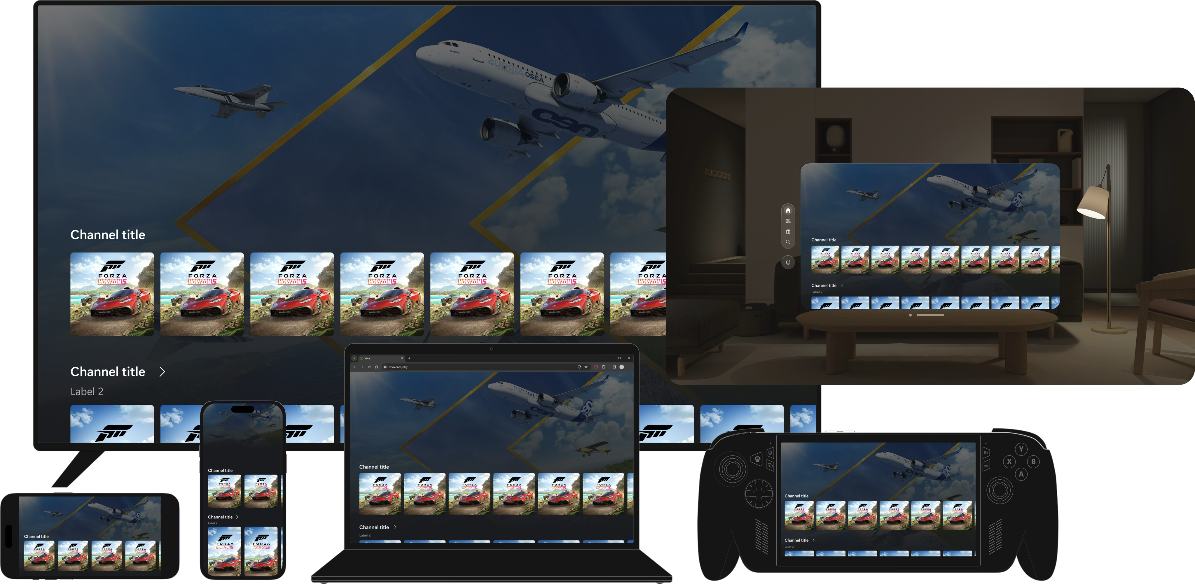
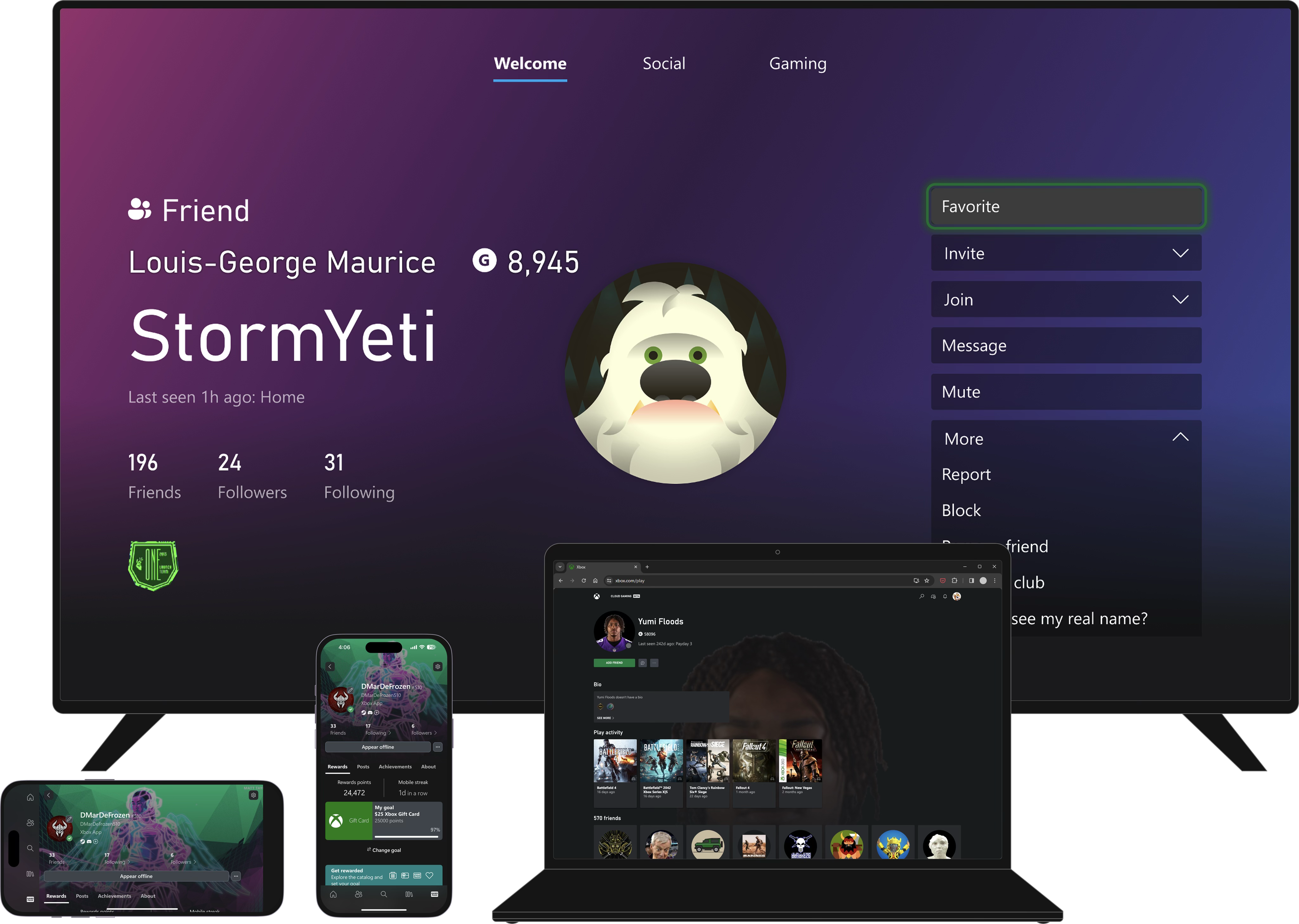
One scalable design system that keeps Xbox experiences recognizable, accessible, and fast to ship—no matter which surface a team is building for.
Story
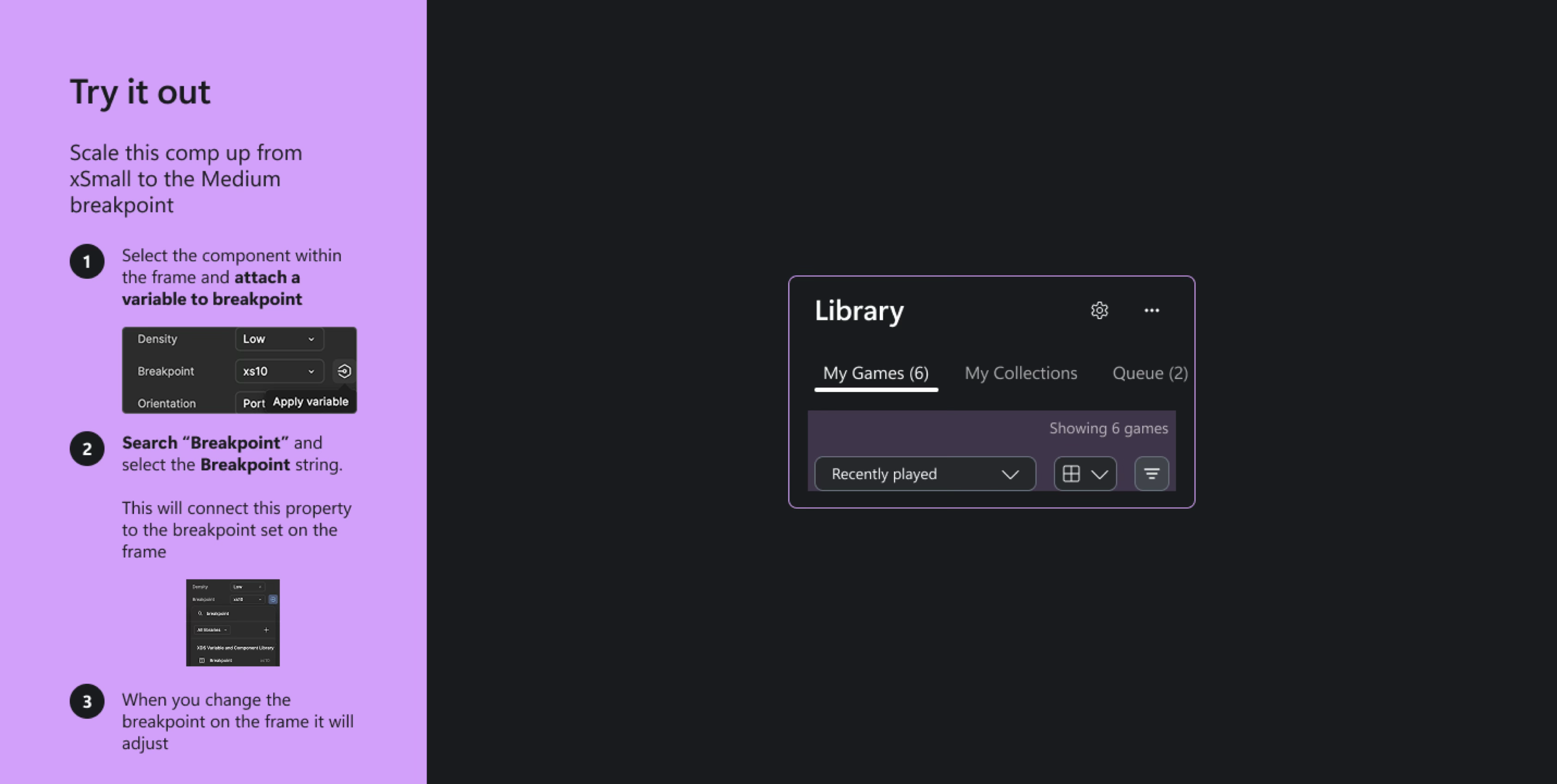
Early variable prototype
After Figma variables shipped, I prototyped component-wide scaling through a small set of sizing variables for handoff—fewer hard-coded values and less screen-by-screen breakpoint work. We framed design-once-scale-everywhere as lower cost and a clearer read on how to serve customers, especially across multiple Xbox endpoints, so quality held up wherever people played.
I ran a cost exercise with engineering leaders, which ultimately funded this project. The entire org needed to upskill on how to build for the web. We needed a way to make that more feasible so we could start reaping the benefits sooner.
Approach 1
First approach: Page by page migration
I had scoped out the home page as an early candidate and floated the idea of full page migrations to help break up the work. My rationale was that our teams were arranged by device endpoint, so each group could independently conduct the migration when they were ready.
I later learned that would mean maintaining two apps, which would introduce a lot of complexity. We lost a few weeks chasing a page-level migration that wasn’t realistic.
Approach 2
Second approach: Component-based migration
After feedback, we mapped the app end-to-end and saw the same components repeating across platforms. Page-by-page wasn’t the bottleneck—components were.
Leading with components let us ship reusable pieces in batches and compound progress instead of grinding one screen at a time.
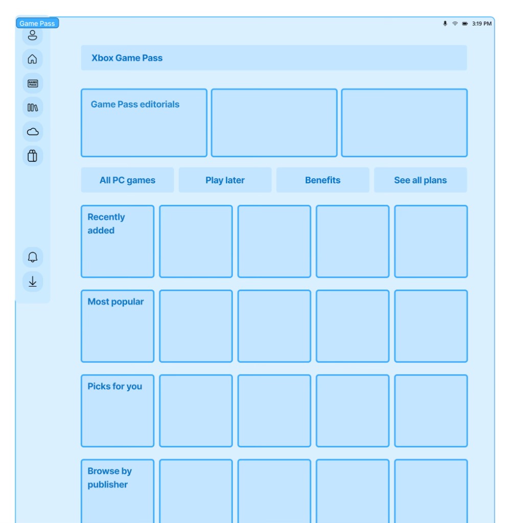
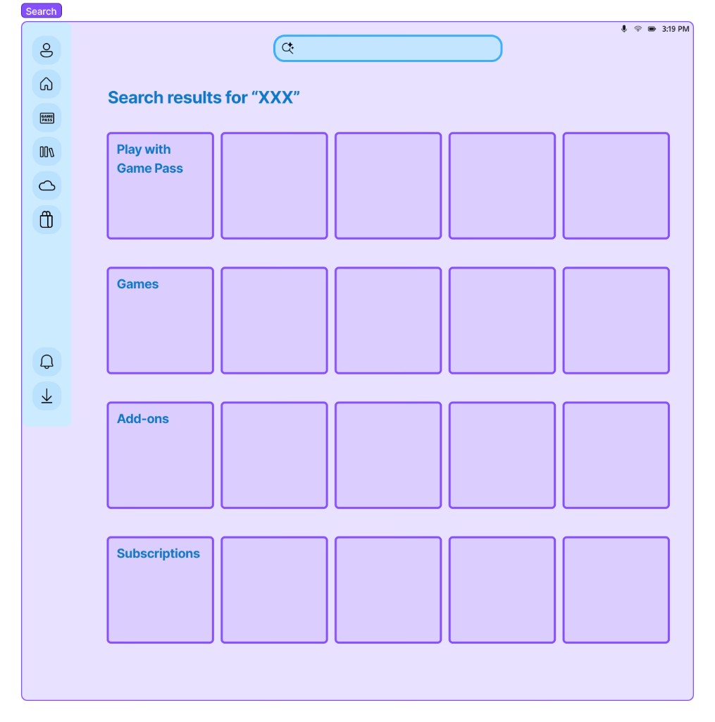
Grid systems and variables
Documentation & adoption
The hardest part of a system isn’t the first release—it’s keeping teams aligned as the product evolves.
- usage guidance,
- migration paths,
- examples grounded in real flows.
I focused on documentation patterns that reduce ambiguity: when to use a component, how it behaves across breakpoints, and what accessibility guarantees come “for free.” That lowered repeated questions and made reviews faster for both design and engineering partners.
Impact: We’re live!
Open play.xbox.com- Scale to every screen size
- Cut delivery costs and duplicate work
- Freed teams to focus on innovation
- Helped product designers think more in systems
- Migration complete